Find cheap domain names for your website

Low Domain Prices
Affordable domain names starting at $1.00 with additional discounts available for buying in bulk or by joining our Discount Program
Safe & Secure
Enterprise-level security with advanced anti-spam filters
Large Growing Registrar
The best prices on millions of domain names and 400+ domain extensions available
24/7 Customer Service
Our world-class support team is available at all hours, 365 days a year
Whatever you need, we can help
Everything you need to start


Start With a Cheap Domain Name
We offer the lowest prices on domain names, hosting, and email services, in the market. With our free API, bulk discount promos, and reseller program you have all the tools you need for developing!
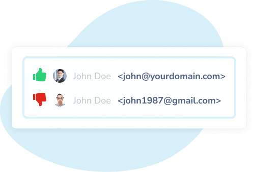
Business  or Google Business email
Starting from $0.00 /month
Get domain-based email hosting services today and increase your brand’s credibility

SSL
For $9.59 /year
NameSilo recommends these SSL certificates for any business or individual looking to secure their website.
 requires all sites to use SSL
 Get NameSilo Hosting
Get a hosting package from $2.99 /month
We run our services on cutting edge technology! Packages include WordPress, a FREE website builder tool, and Lite email.

NameSilo vs Other Registrars
.COM
17.29
FREE WHOIS Privacy
FREE Email Forwarding
FREE Domain Defender Protection
FREE Custom WHOIS Records
FREE DNS Management
BULK DISCOUNTS

Over 150+ Payment Options Accepted
One of the most generous affiliate commissions with detailed reporting to help you manage your referrals. It’s free and easy to join!